01.
Pei Design Boutique stationery & lifestyle brand



Design for Lives Well Lived
My work blends design, product, and narrative to build brands that feel intentional and culturally attuned. I've worked across consumer, lifestyle, hospitality, healthcare, and real estate, with a focus on how design shapes perception across digital, print, packaging, and in-person brand experiences.
Before returning to agency work, I founded Pei Design, a boutique stationery brand sold in 200+ retail locations worldwide. Running a consumer brand taught me how products are imagined, designed, made, and brought to market across product design, brand building, production, sourcing, e-commerce, wholesale, and marketing, and shaped how I think about design as both creative expression and brand strategy.
Outside of work, I'm drawn to spaces and objects — from shaping my home into a calm, intentional space to beautifully made cookies and cakes and packaging design that bring intention into daily life.






Boutique stationery & lifestyle brand
Brand / Product / Collateral / E-Commerce
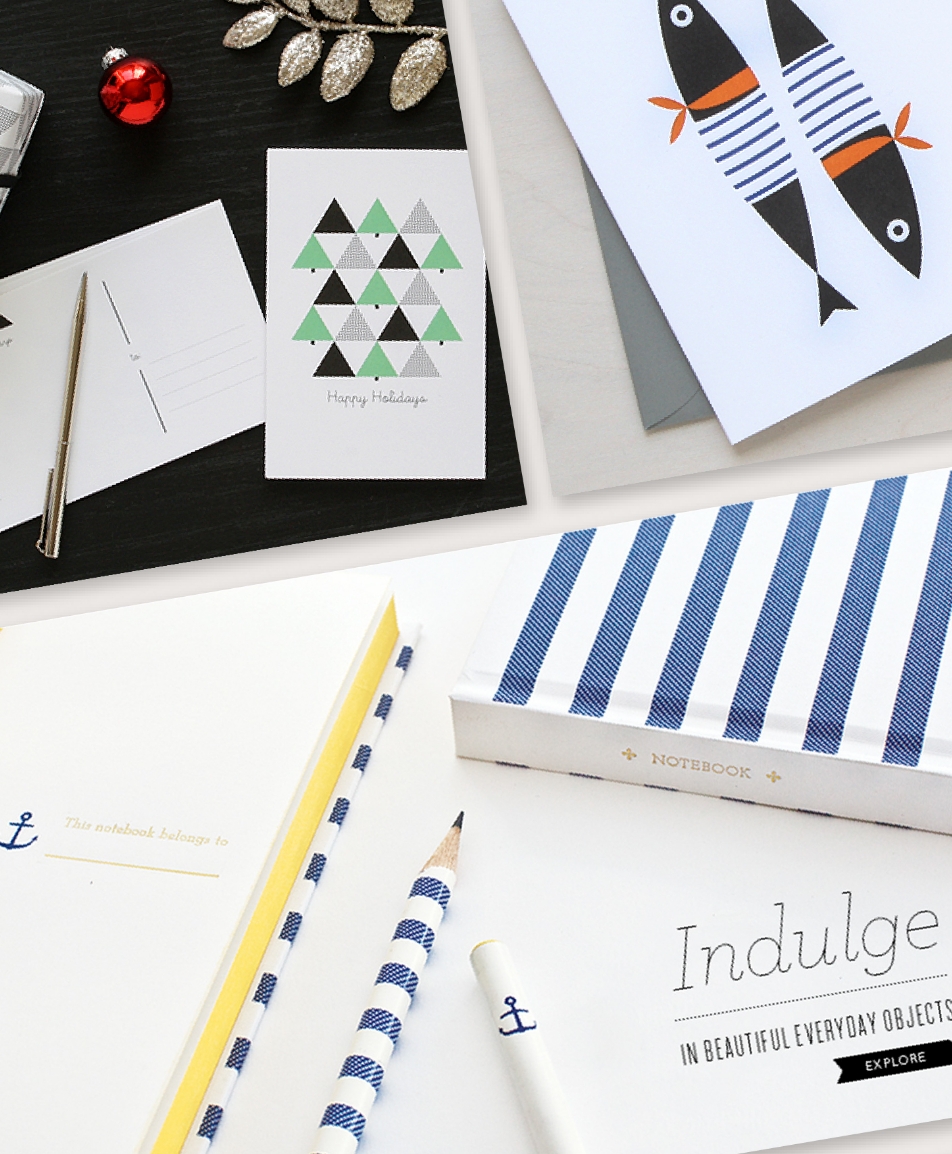
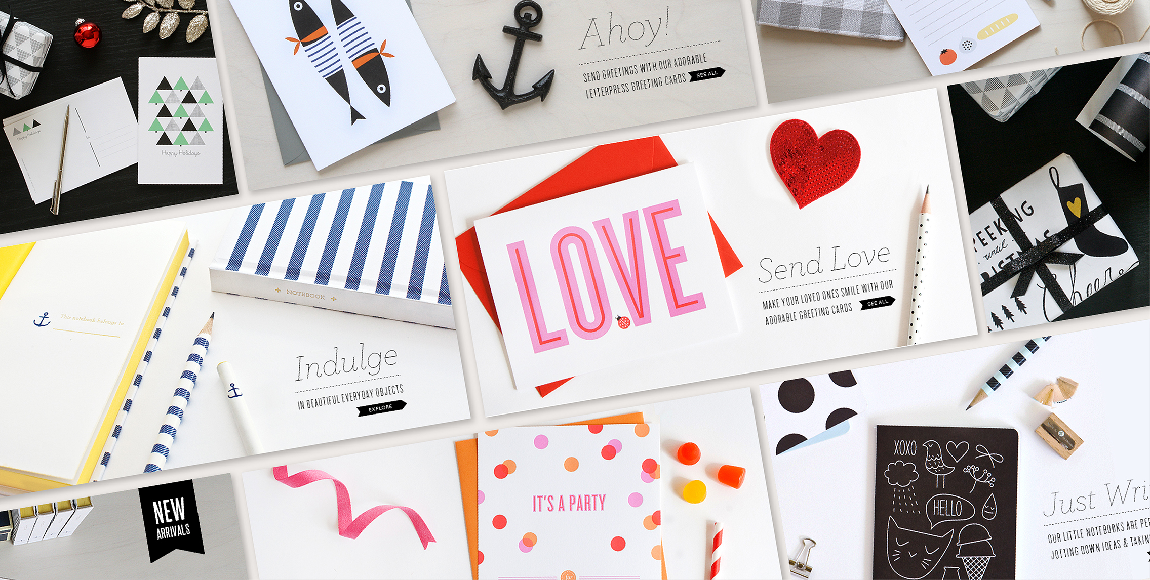
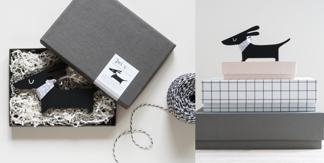
A boutique stationery and lifestyle brand designed for modern living, blending whimsical illustration with clean forms and tactile materials across greeting cards, stationery, and everyday gifts. The brand was founded and developed from concept through execution, shaping both the visual identity and overall product direction. The brand extended across product, commerce, and marketing to create a cohesive presence across wholesale, retail, and digital channels, with collaborations and editorial features.
Epinephrine auto-injector
Campaign / Print / Social
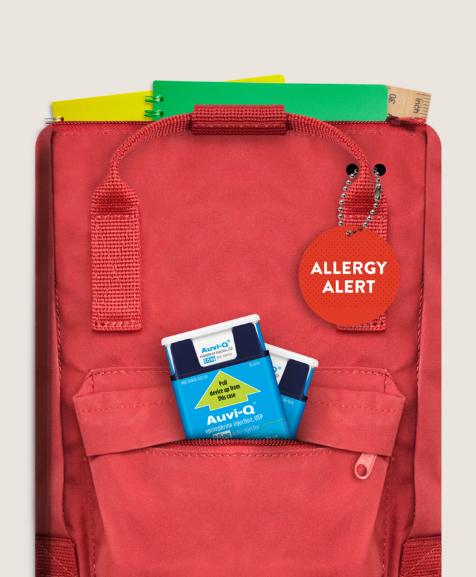
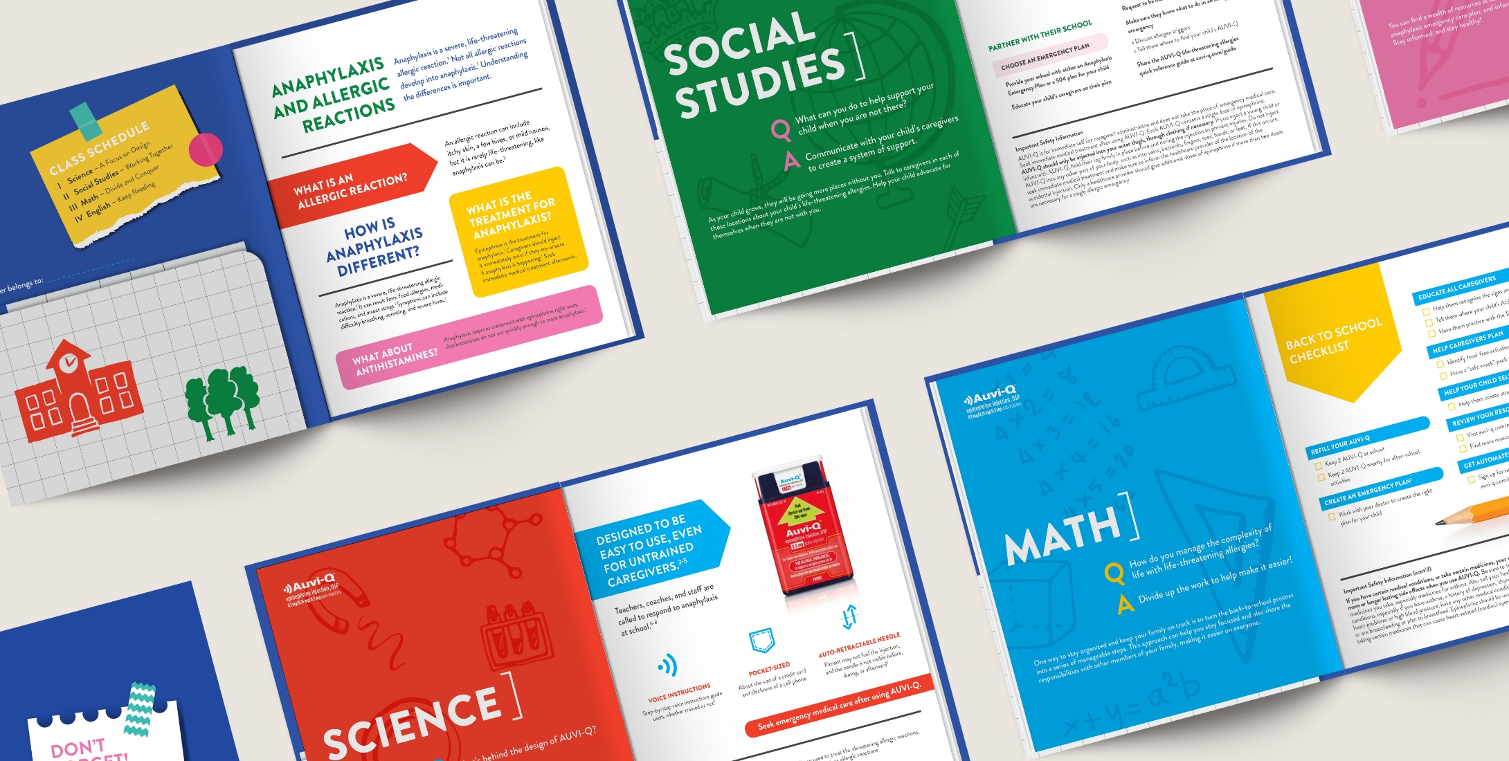
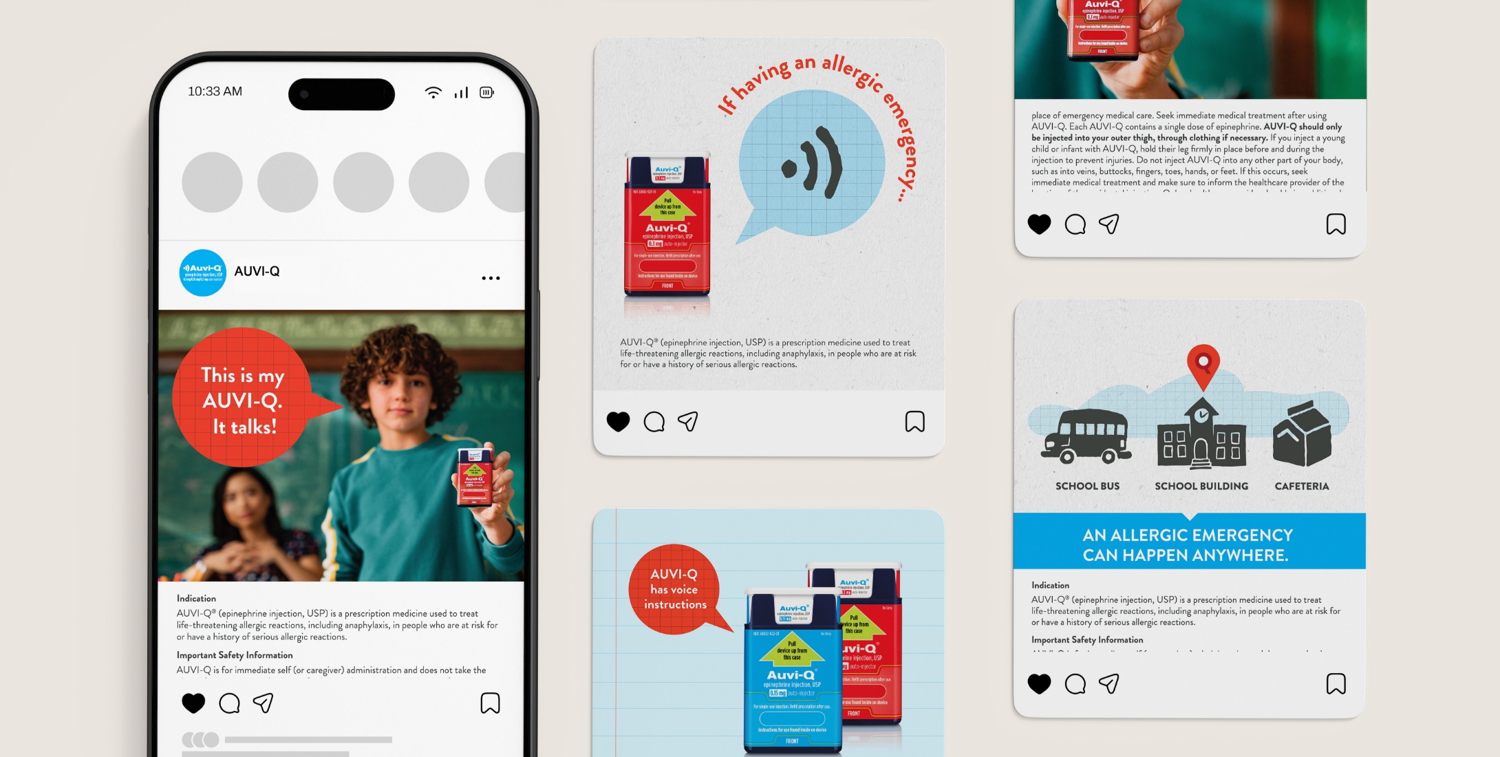
A back-to-school campaign for an epinephrine auto-injector, centered on the idea that allergic emergencies can happen anywhere as children become more independent. The design uses a school-inspired theme to organize information into clear, accessible content. The campaign extended across print and social, including a school-themed starter kit with a backpack-inspired carrier and a school folder–inspired brochure, with educational materials that support awareness and confidence.

Residential real estate
Brand / Print / Social
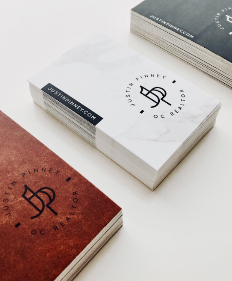
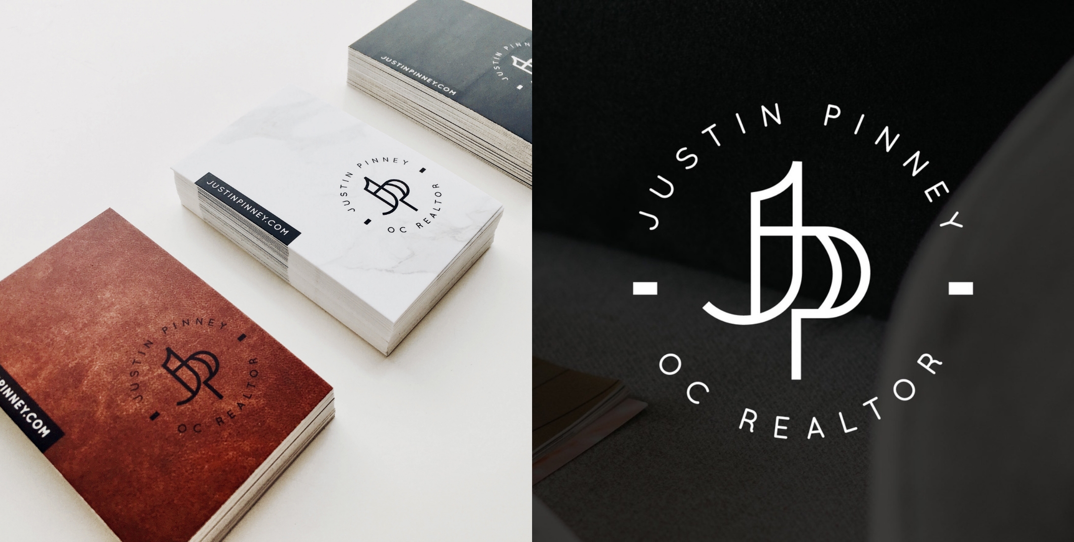
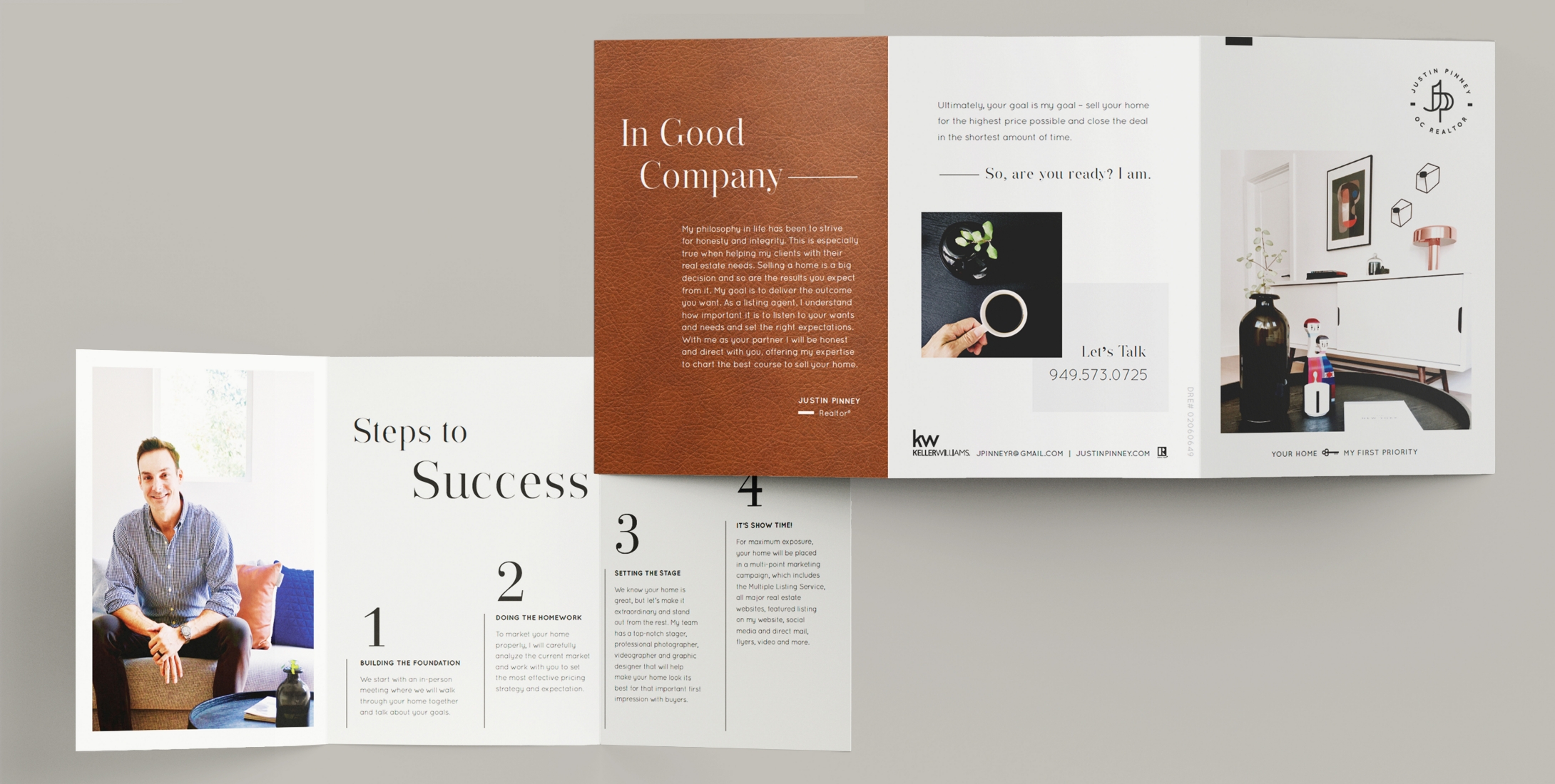
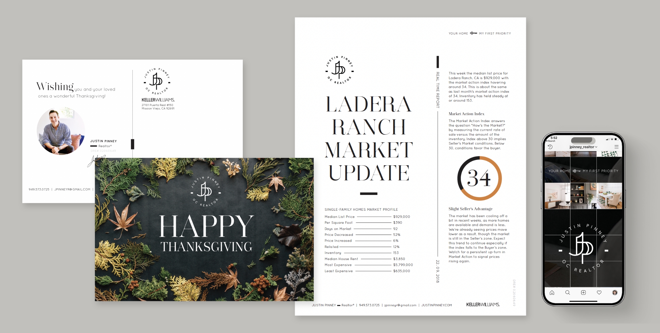
A personal brand identity developed for a residential real estate agent, built around the idea of a trusted navigator guiding clients toward their ideal home. The compass-inspired monogram symbolizes direction and discovery, while business cards feature material-inspired textures such as leather, marble, and stone that reference surfaces found in the home. The brand extended across print and social marketing, from mailers and seasonal cards to social content, reinforcing a refined and elevated real estate presence.
Modern home furnishings retailer
Illustration
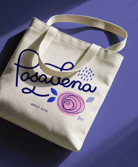
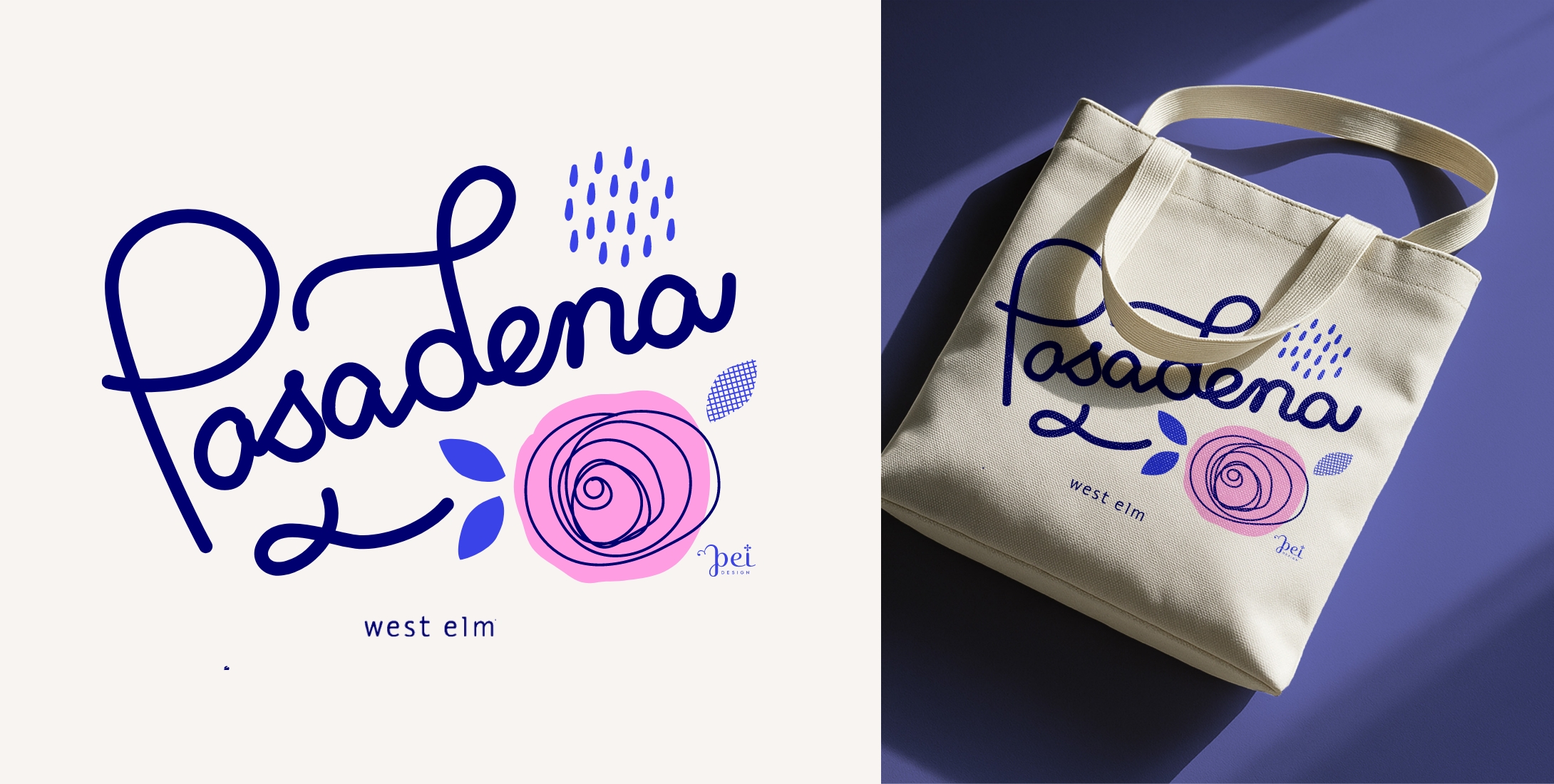
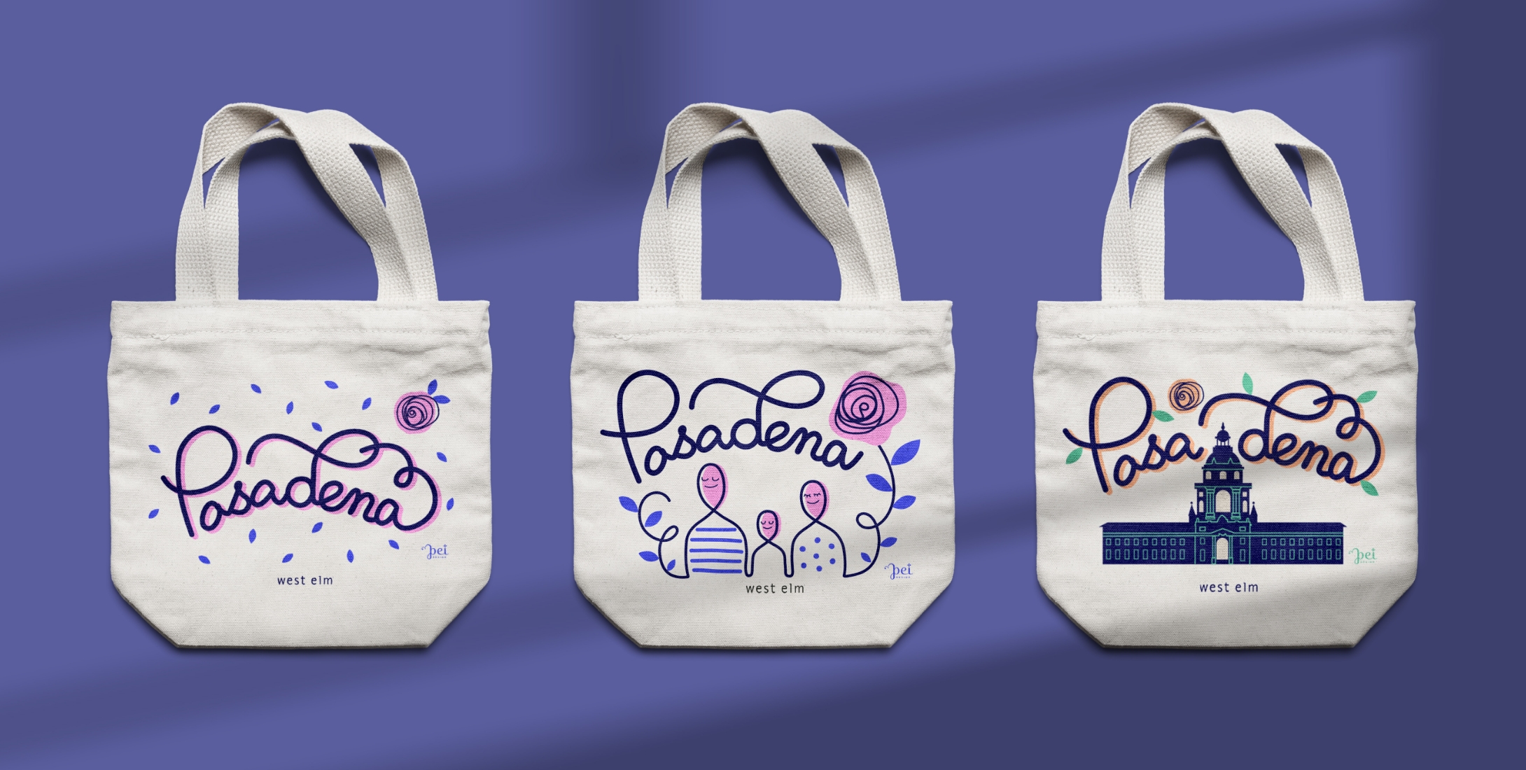
A limited-edition tote bag designed for the opening of a new West Elm store in Pasadena, created in collaboration as a local artist. The concept draws from Pasadena’s identity as the “City of Roses,” explored through a range of graphic directions reflecting the city’s character—from floral expression to references to local architecture and community. The final design distills this into a playful, expressive floral graphic, capturing a distinct sense of place.
Co-working space
Brand / Digital / Print / Environmental
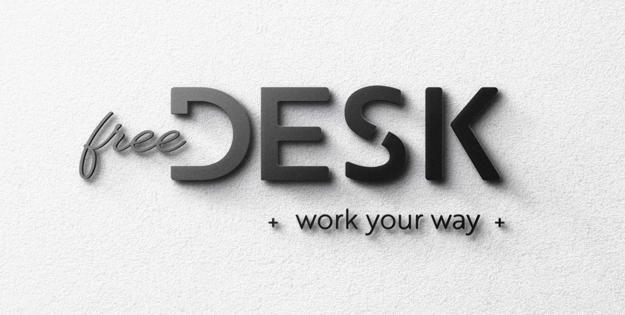
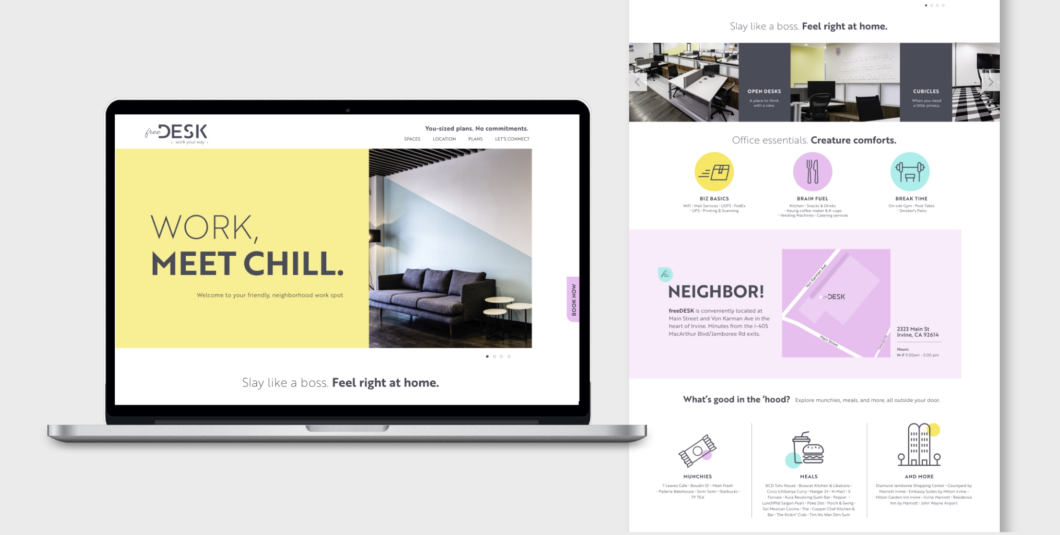
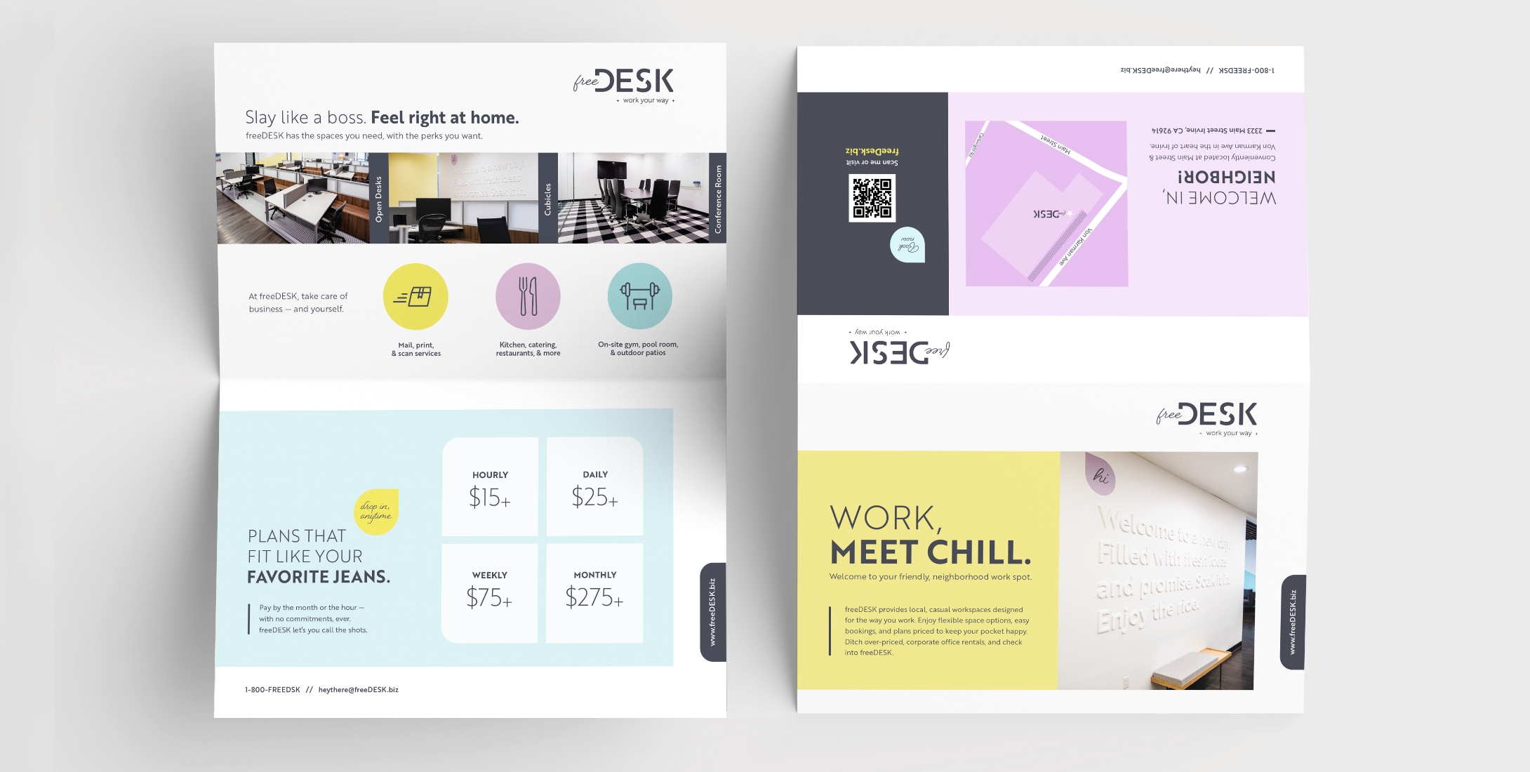
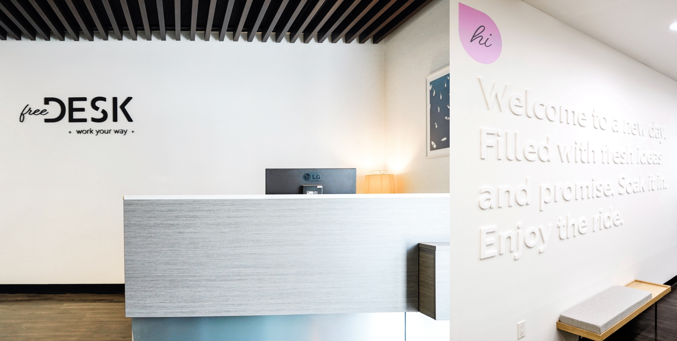
A flexible coworking space designed for people to work how they choose. The logo reflects the brand’s personality by pairing a handwritten wordmark with clean, structured typography, balancing ease with clarity and function, while the letter S suggests openness. Soft color blocking, simple geometric elements, and approachable graphic details carry across website, print, and environmental design, creating a relaxed, welcoming atmosphere that supports a flexible, human-centered way of working.
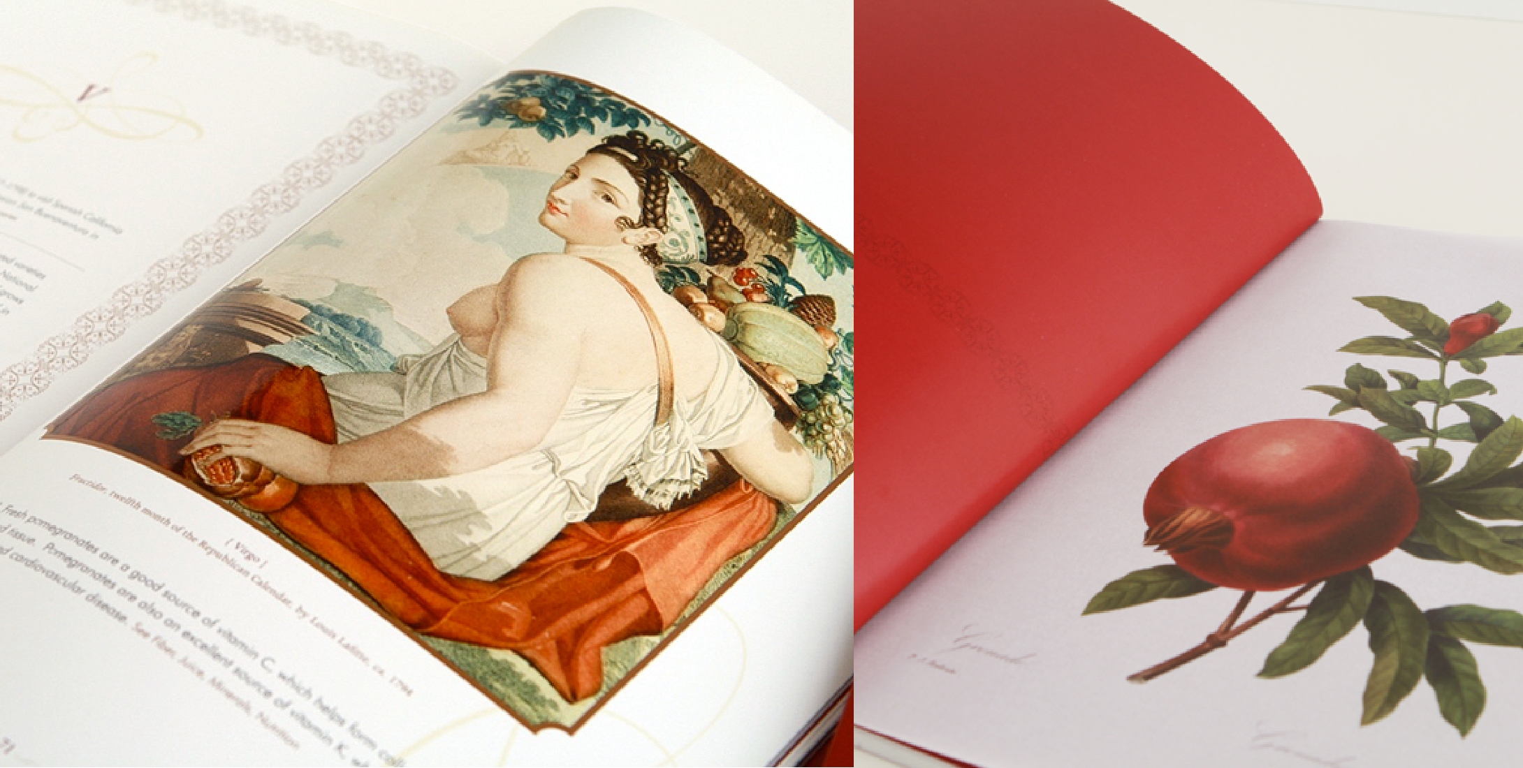
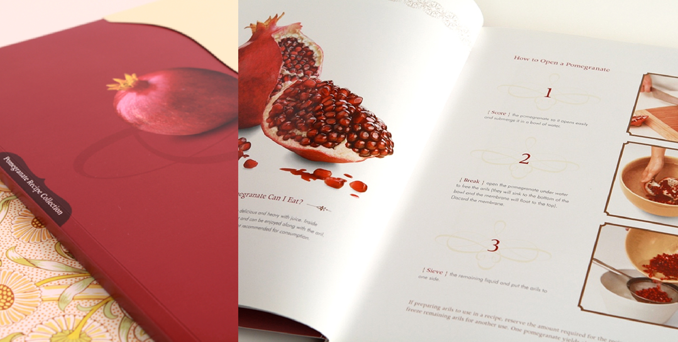
Pomegranate juice & beverage brand
A personal brand identity developed for a residential real estate agent, built around the idea of a trusted navigator guiding clients toward their ideal home. The compass-inspired monogram symbolizes direction and discovery, while business cards feature material-inspired textures—such as leather, marble, and stone—that reference surfaces found in the home. The brand extended across print and social marketing, from mailers and seasonal cards to social content, reinforcing a refined and elevated real estate presence.
Premium California pistachios
Packaging
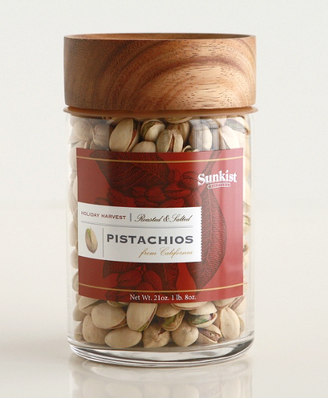
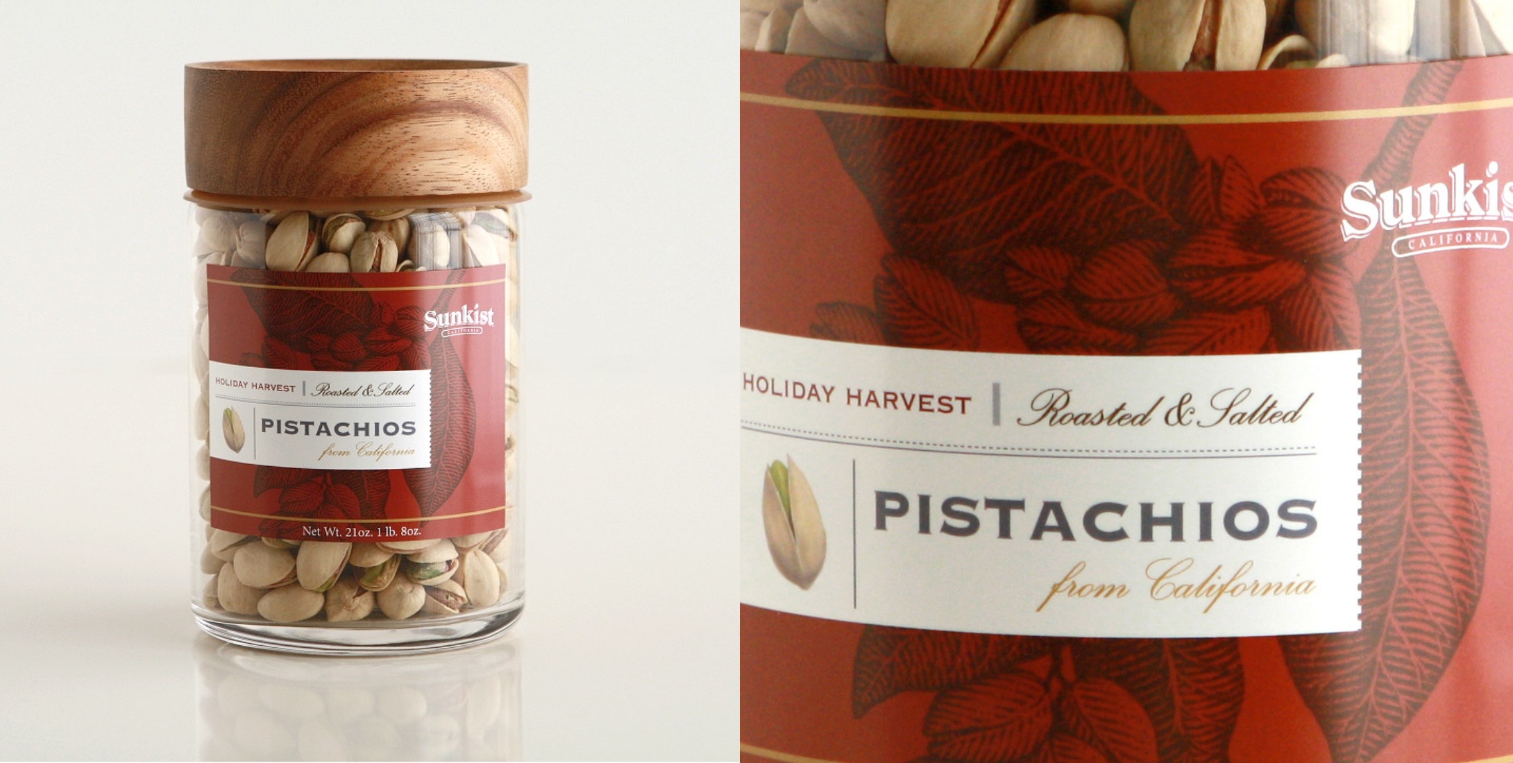
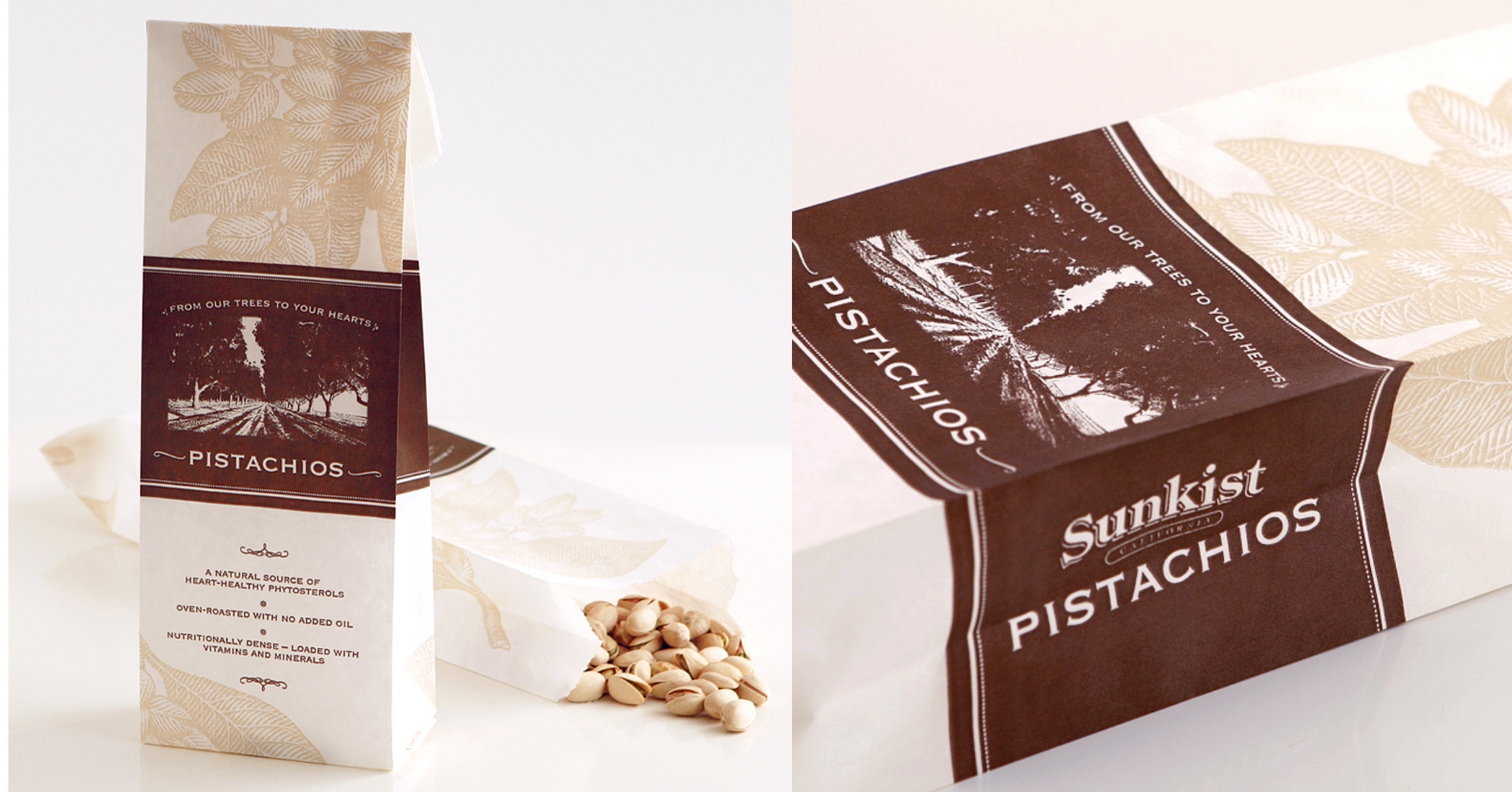
This holiday packaging was designed as a limited-edition, giftable experience that elevates everyday snacking into a seasonal offering. The canister uses festive tones and a premium label with fine hatching illustrations to evoke craftsmanship and natural origin. A two-color paper bag extends the system for self-fill, maintaining a consistent visual language across formats. The result balances holiday warmth with a refined feel, positioning the product as both a giftable item and a premium pantry staple.
Premium California pistachios
Brand / Print
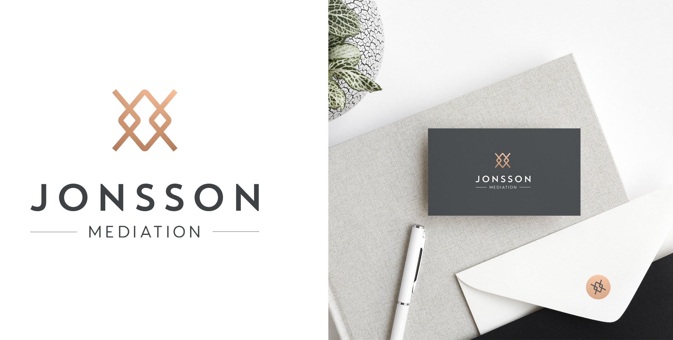
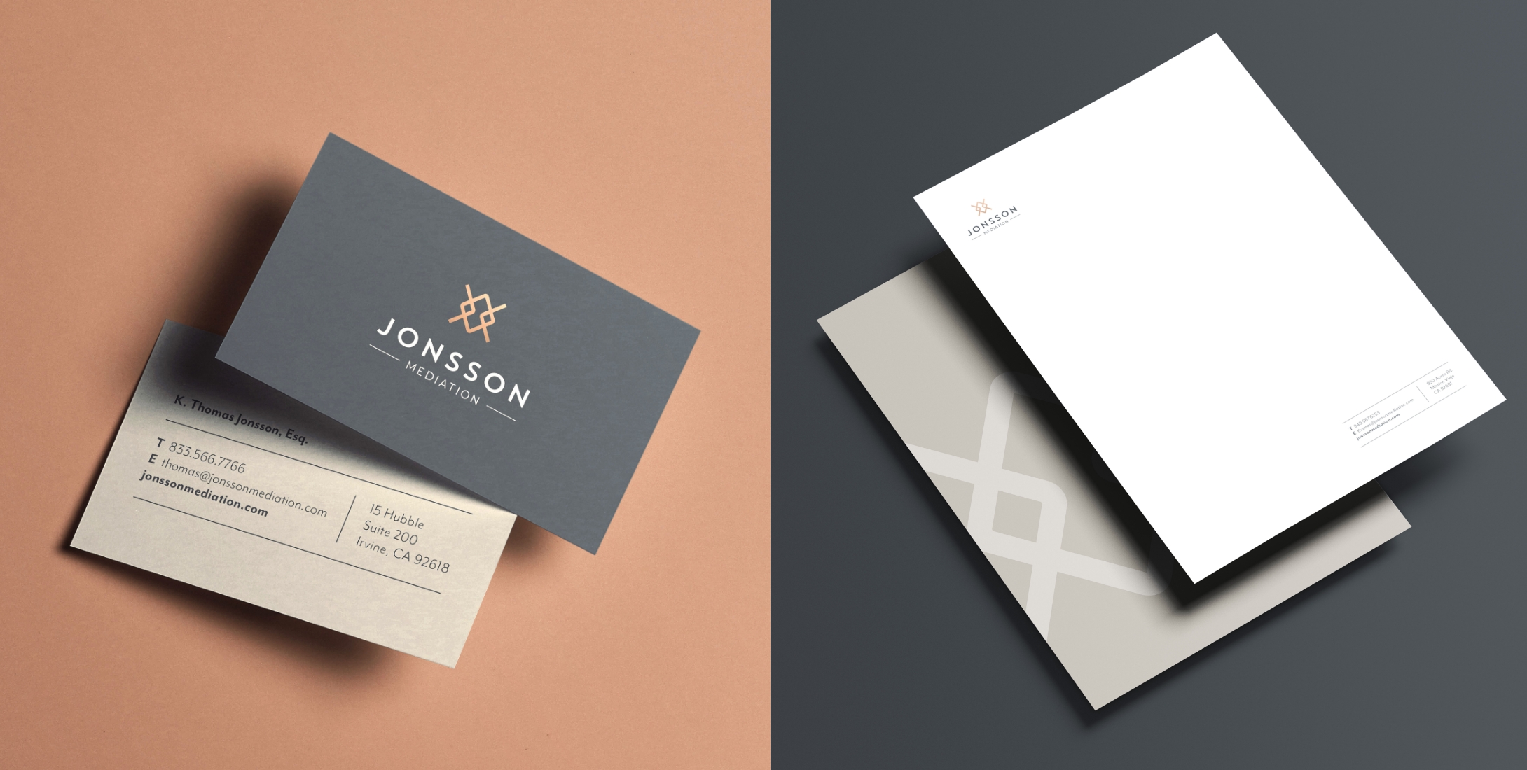
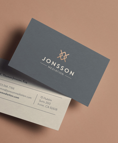
Jonsson Mediation provides legal mediation services to help couples navigate separation and divorce with clarity and resolution. The logo mark reflects both separation and connection, with two opposing arrows representing individuals moving in different directions, anchored by a central diamond that symbolizes the mediator guiding both sides toward a balanced outcome. A restrained color palette and refined typography create a calm, professional, neutral tone that supports trust and clarity during a sensitive time.